Commonwealth Coffeehouse — Branding
2015 | Client: Jose Ramon Campos | Role: Creative Director, logo designer
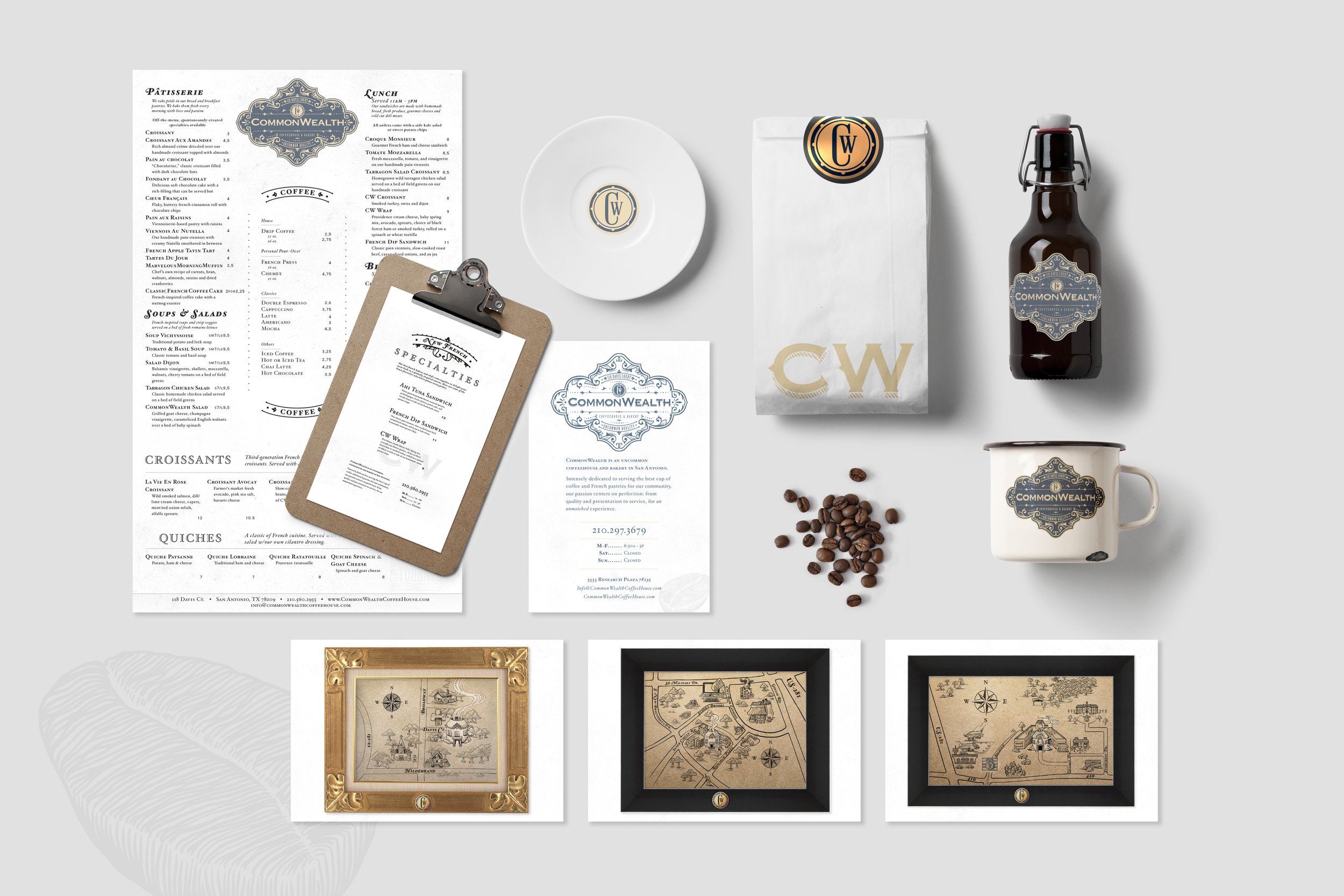
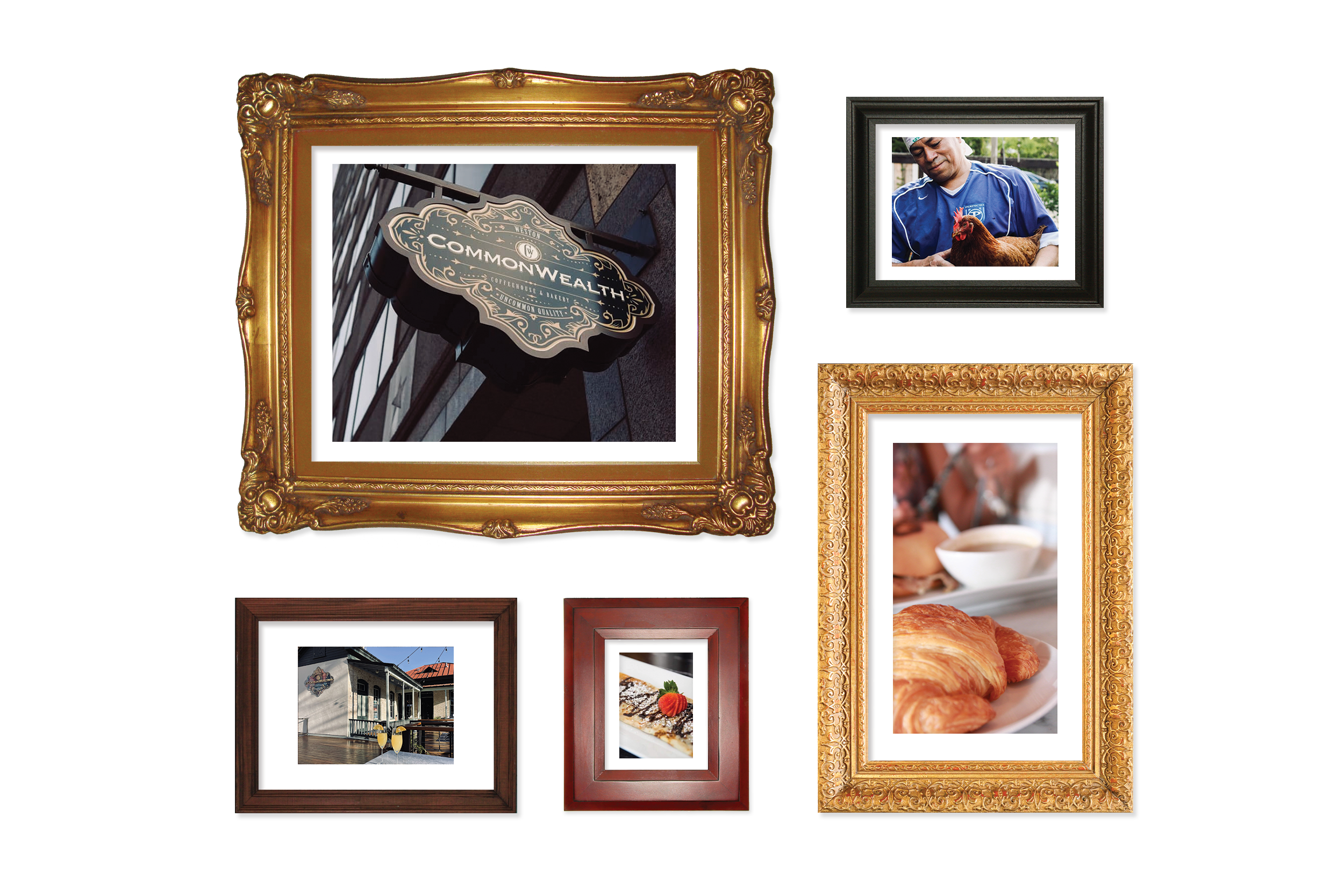
Expertly placing old-world relics, vintage maps and a mixture of eclectic talismans, trinkets and decorations, owner Jose acted as interior designer to the shop. As he explained it, CommonWealth is meant to be a place where all cultures are encouraged and welcomed to have conversation. It is a meeting place, a home for great thinkers and a place to relax on a Sunday evening. CommonWealth is dedicated to assuring the atmosphere is authentically European that the owners poached a third-generation baker from France and flew him across the Atlantic to provide genuine French pastries.
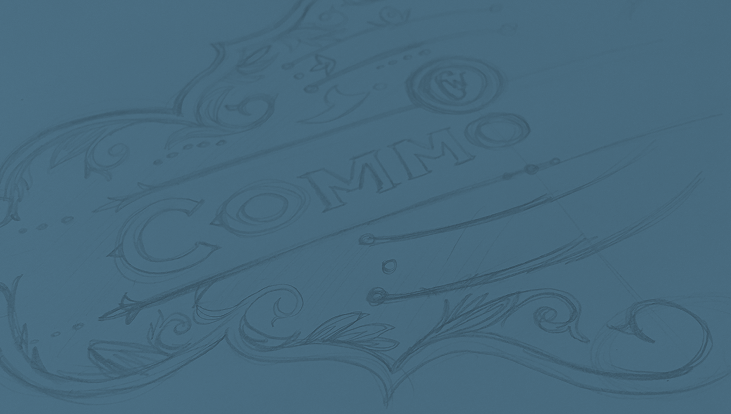
When it came to the logo, Jose also wanted something reminiscent of an old way of living. A symbol for a way of life. It was to be a badge for the commonwealth of CommonWealth. In order to capture that feeling, the logo had to be designed in a way that felt old, yet new, at the same time. Taking a traditional approach to the design, I started the process by sketching out ideas. I took inspiration from 1800s Western and European ephemera. I wanted to make sure that the logo captured a sense of regality to it that most coffeeshops don’t abide by nowadays.